The author’s views in this article are entirely her own and may not always reflect the views of Ranking By SEO.
Good advertising isn’t just about ‘selling’ a product. It is about creating an impact that lasts, and effective visual adverts can do that.
Ask any successful brand and you will find that they use advertising to ‘influence’ behavior to create more sales. It is because influence has an evergreen value – a value that can be greatly enhanced through the use of visuals.
This is why visual communication is being used widely, both offline and online. Visuals enhance content appeal by giving it a story. And stories are much more memorable and much less intrusive than a piece of salesy content.

But visual advertising can fall flat if the various elements of the advert are not optimized. From the elements in visual creative (subject, color, lighting, focus etc) to the textual support copy, everything plays a key role in making effective visual adverts.
To ease your advertising story, here we have compiled a list of guidelines for designing effective visual adverts for your paid campaign:
Ensure that your call (to action) is heard and attended
A call-to-action is your ad copy; text accompanied with the image that compels a user to take the action.
So if visual content is the bait, CTA is the hook that captures your audience to create actual results. Without an optimized CTA, your call may be heard but if left unattended, it doesn’t really help you achieve your business goal.
First, keep your ad copy crisp. Nothing is more disengaging than using multiple textual lines in a visual advert. There is no point of having a visual ad in the first place if you have lost of textual content.
Let visual consolidate the most of your message. Then, use text to guide the users to take the next step. And focus on optimizing it.
This can be done by creating an urgency. In fact, the impact of your written CTA can be amplified by creating a relevant appeal through the visual, like in this case:

Tap into the psychological impact of visual marketing
There is a reason why visuals create much more compelling stories than text. Visuals tap into your consumers” psychology and influence purchase behavior by impacting their moods.
This psychological effect can be created through colors or repetition or even through symbols.
Colors
When you create a visual, you don’t just put colors next to each other: you use these colors to create an emotional response. The psychological effect of colors is used in brand logos, products, and even content.
For instance, blue creates a positive effect. Similarly, red and yellow trigger hunger; the reason why so many food chains employ these colors.
Understand the impact of colors on mood and use this information to take off your visual strategy to a higher level.
Repetition
Repetition is a very important element in creating effective visual adverts. The trick of repetition works by cementing the truth in a statement; a sentence when repeated over and over again becomes more concrete in our minds.

This trick also works by building memorability because repeated elements create a quick ad and thus brand recall. Just try to avoid repetition fatigue. Build variations by tweaking the ad elements.
Symbols
Depending on your target audience, you can use various generic symbols as well as colors to create a specific visual mood. Start by picking significant shapes or icons.
Create quick engagement with a simple representation of ideas
Visual advertising focuses on ‘visual talk’. So it makes sense to talk visually and rely less on words. The focus should always be on making the visual speak and to make the visual message simple enough for your audience to understand.
Additionally, simplicity comes with the benefit of accessibility. For businesses that have a diverse target audience, simple content is much more useful than complex representations.
Use your visual creative to break the complexity of the idea into a simple graphic which is easy to understand. The ease with which your advertising message is decoded is what generates a quick appeal.
Employ GIFs or videos or infographic snippets in your ads to grab your viewers’ attention. Use these persuasion techniques to create killer graphics.
Own your visual creative to make effective visual adverts
If your viewer looks at your ad and says, “Oh wait, I think I have seen this visual before.” In that one moment, they already know that you don’t have the ownership of that visual creative.
While it is a common practice to pick an image from the Internet and use it to advertise, it doesn’t help you project a unique appeal. And for visual adverts, this ‘unique appeal’ is something that gives you an edge over others.
Additionally, ownership also helps in making your brand memorable.
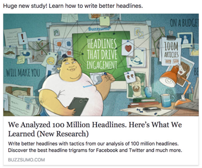
Like we looked at this ad and we instantly knew it was BuzzSumo. You will find the same character in all their visuals. Through this method, they employ multiple tricks in one creative: simplicity, repetition, and ownership.
Convey your message with visual metaphors
And we say this without contradicting the ‘keep it simple’ statement.
The impact of visuals is enhanced through the use of ‘metaphors’. Metaphors can remain simple and still go out of the box to create a quick appeal.
Visual metaphors can be created by finding elements that mimic the actual situation.
In the following ad, the human helmet becomes the visual metaphor. It not only gives the core message but creates a high impact because it amplifies the idea by emoting it.

These metaphors can even be crafted by tweaking the design elements (color, whitespace etc) of a visual.
Power up your ad with visual humor
Advertisements. They have the potential to bring great value to businesses but ask any viewer and they will complain about how they want to skip anything created with ‘advertising’ intent. With such reputation, how can you make effective visual adverts?
Sometimes, humor can be your best answer.

Humor is effective because it breaks the ‘intrusive’ image of advertising and catches people off-guard. With humor, the usual ‘skip’ response to an advert is replaced with a grin or smile or laughter.
Humor infuses a positive ‘emotion’ into advertising. And that’s not all.
Humor can drastically improve your conversions by helping you build a better relationship with the consumers.
But humor can also be tricky to incorporate. When creating funny visual ads, always ensure that you stay away from sensitive subjects and focus instead on neutral ideas.
Utilize the law of movement to your advantage
The moving frames in a video can deliver much more information than a static piece of content. So video advertising can be really great in capturing your audience in the minimum time window you have.
Additionally, videos really work in consolidating a big message into a few frames. Plus you can simplify the idea to a greater extent than you can do with an image or a GIF.

In this ad, Jean-Claude Van Damme performs his most epic split. This ad by Volvo trucks, demonstrating the stability of steerings of their trucks, invited this Youtube response: “You know your ad works when people actually look for it on Youtube, not when it pops up before a video”. That’s exactly what your ad should aim for; creating space for re-visit.
The ad has received 88m views till date.
‘Channel’ize your visual powers
The online landscape has bestowed upon us a great power’; a power that one must learn to channelize. With the availability of numerous advertising platforms, there is a greater need to serve the right content for the right platform.
Visual advertising takes a different shape and size on different platforms. The visual that best fits your Twitter strategy may not be optimal for Instagram.
The key to introducing a visual entry point through an ad lies in optimizing your advertising strategy for that particular platform.
Advertising on Youtube? Visual appeal isn’t as important as the placement of your CTA. If you are using the pre-roll advertising format, you need to focus on offering the CTA in the first few seconds.
When using Instagram advertising, appeal definitely becomes the bait. Since Instagram is a visually rich platform, CTA comes next to appeal.
So your visual ads will take a different optimization approach depending on the channel where they are being placed.
Study the audience behavior on the platform, understand the ad specs for that particular channel and accordingly modify your visual advert.
Conclusion
Effective visual adverts are a sum total of many elements – the visual parts (subject, a position of subject, colors etc), textual ad copy, platform friendliness and the destination (the end point where the ad takes your user).
To optimize your visual ad for a positive impact, you must focus on the various elements that go into the visual creative. Especially for video ads, simplify your ad message so the takeaway stays with the viewer even if they haven’t watched the entire video. Also, when advertising visually, try to use your own visuals.
Additionally, to lessen the intrusiveness of your ad, find a fix through humor. Or create a powerful imagery with metaphorical visuals. Once the visual and the supporting text is optimized, it is channel optimization that will govern the success of your visual ad.
Do you want to share any other tips to create effective visual adverts? Leave it in the comment section.

